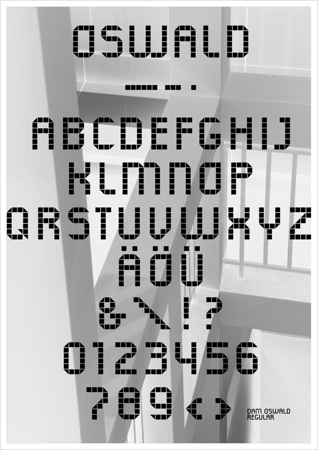
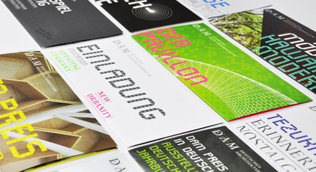
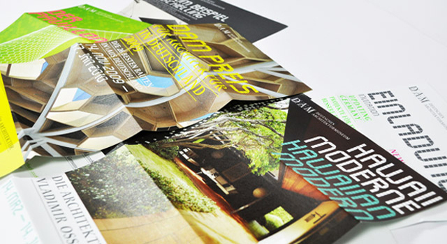
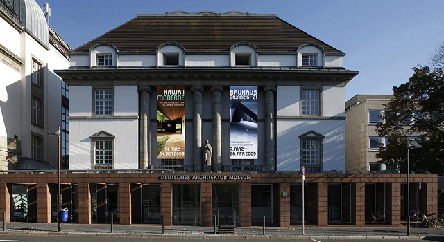
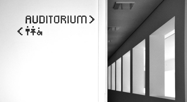
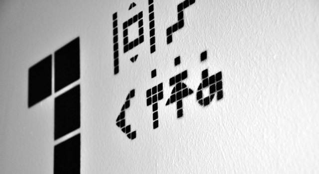
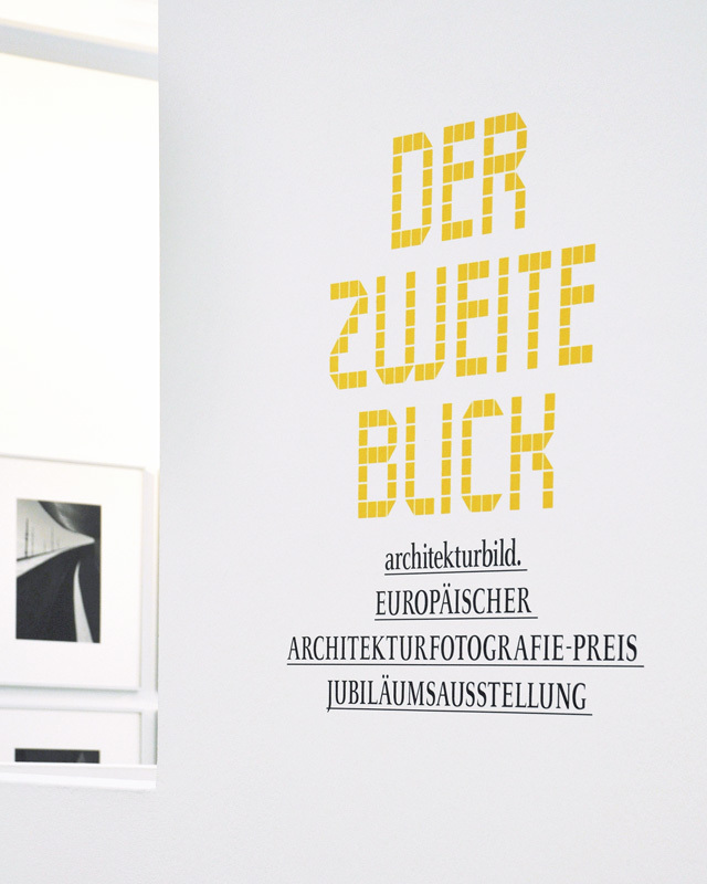
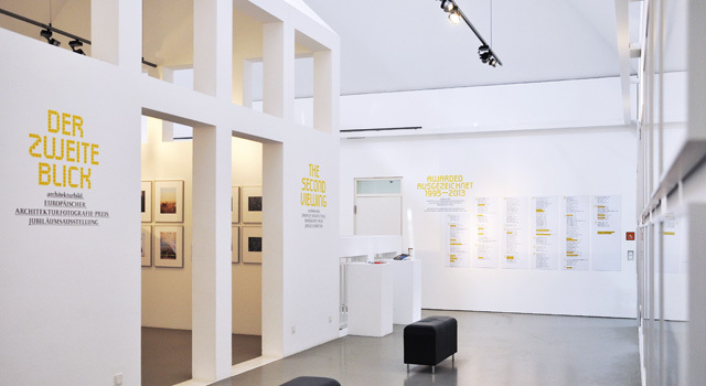
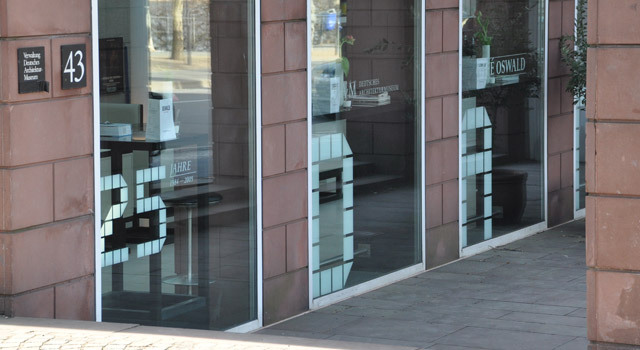
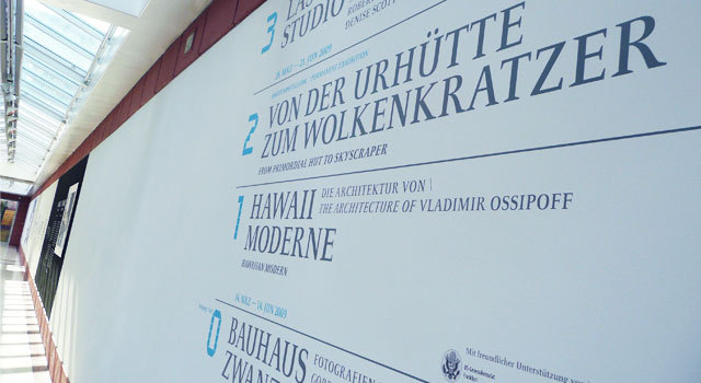
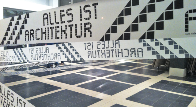
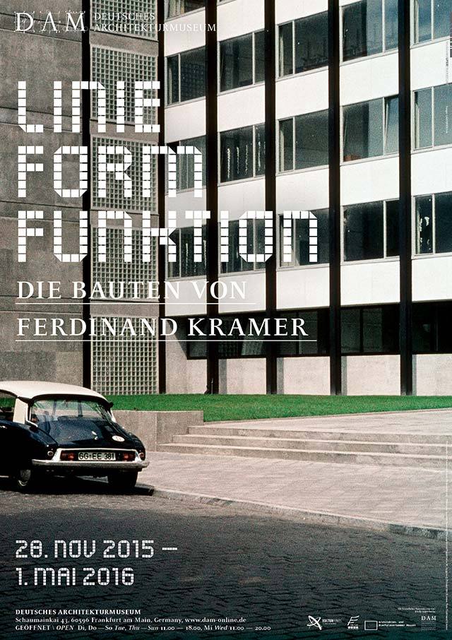
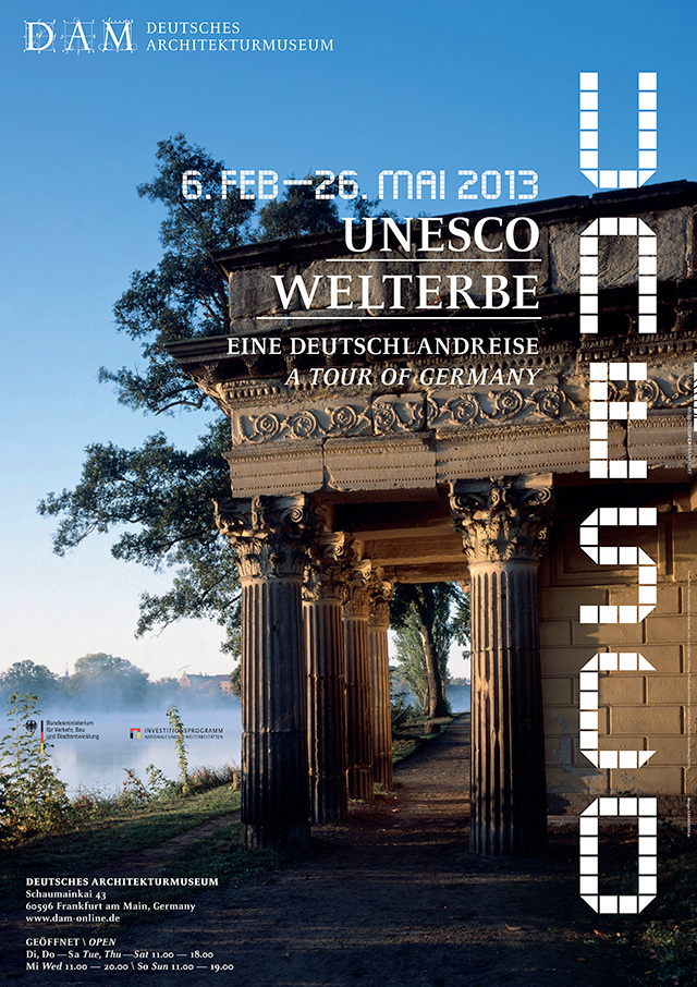
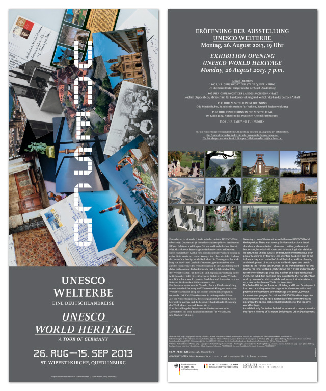
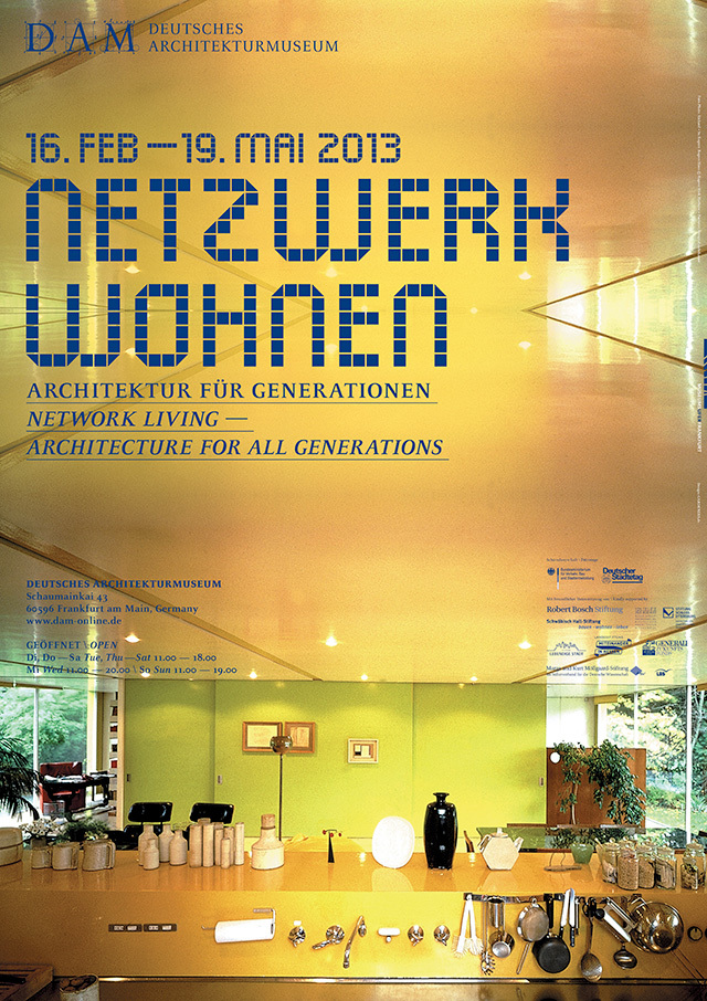
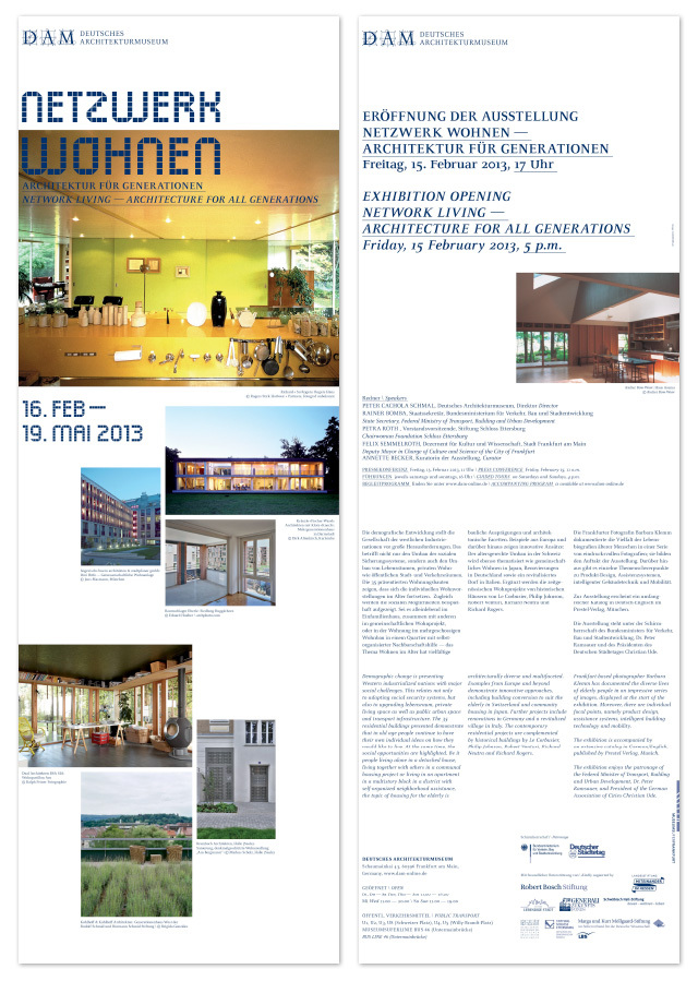
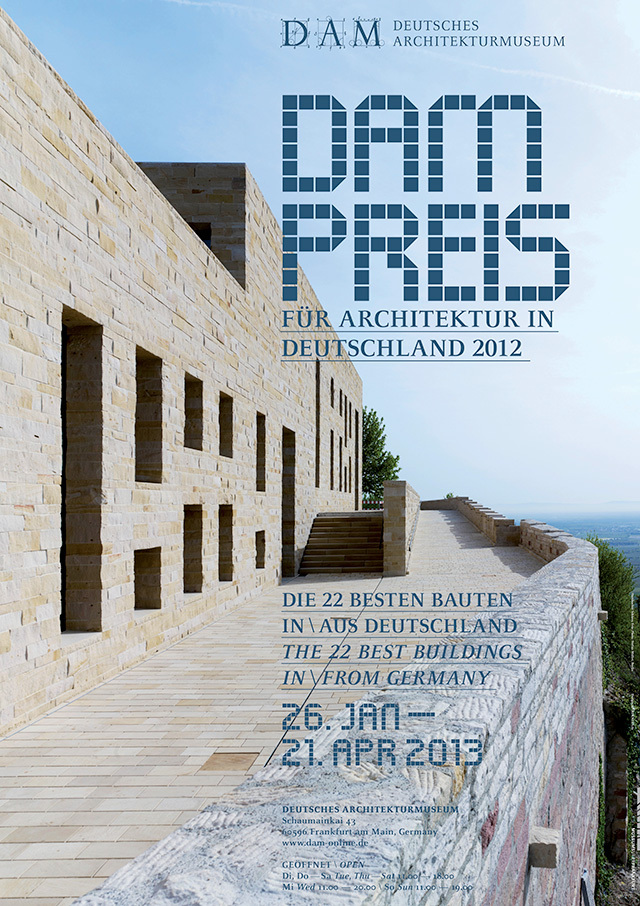
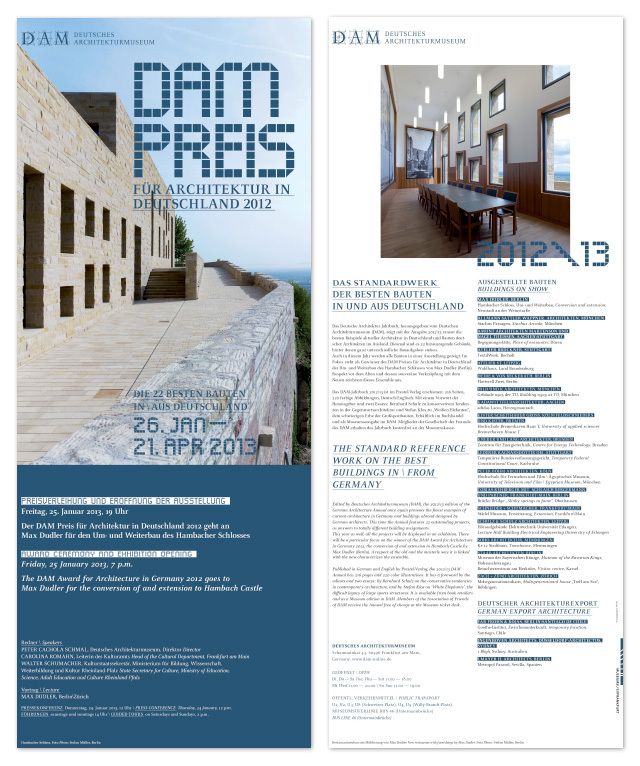
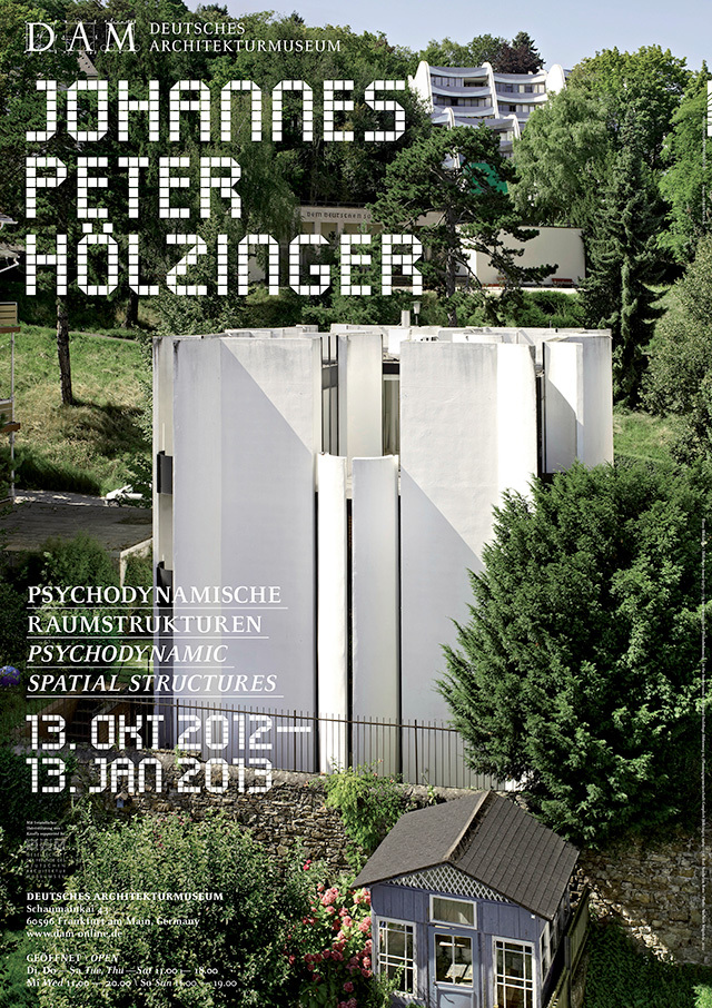
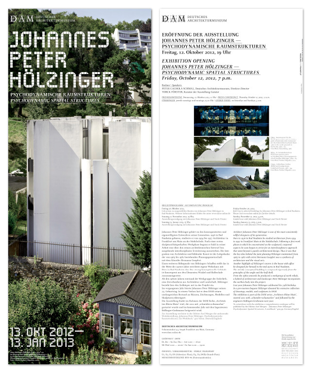
In 2008, GARDENERS won the competition for the new corporate design of Deutsches Architekturmuseum. The Museum’s architecture by Oswald Mathias Ungers combines elements of Modernism and Classicism. We allude to these poles by melding DAM’s specially formulated head font and Celeste in our typography. Font design: Madleen Bommert
iF Award
Communication 2012
The museum stationery was developed in line with the corporate design.
The new GARDENERS guidance system at Deutsches Architekturmuseum steers visitors effectively through the reopened museum building. The coherent guidance system takes its cue from the previously developed corporate font.
iF Award
Communication 2012
 
The new logo and associated illustrative concept gave Haux Wohntextilien a concise and distinctive corporate design.
The office stationery and Website were relaunched in 2007.
GARDENERS designs the presentation of the Frankfurter Lyriktage 2011 / Frankfurt Lyric Poetry Festival 2011
The brochures are printed in two special colors and a glossy varnish.
 
 
GARDENERS created the key visual for the satellite events of the book fair. Everx year we conceived posters, brochure and various advertising campaigns... Client: Kulturamt Frankfurt/Main
 
 
We formulated an independent corporate design for audio book publisher LIDO, founded by Eichborn-Verlag, including a logo, catalogue design concept and cover design concept. GARDENERS was responsible for the design of the first catalogues and CDs. Corresponding CD guidelines enabled Eichborn/LIDO to continue the project in-house.
The design of Eichborn’s first annual general meeting, to be held in the Abs Hall in Frankfurt, was developed in line with the style of the 2000 annual report. We devised ballot papers, invitations, vouchers, the summary of the annual report and a PowerPoint presentation master copy.
Fake, competition / GARDENERS formulated a design concept including event calendar, posters and flyers for “Fake” international summer academy. (Not realized)
We developed the corporate design for the booth of product designer Volker Klag on the occasion of Tendence 2001. We created a brochure of product information sheets and the packaging design for the so-called “Blocks”, alongside office stationery.
GARDENERS won the competition to design the concept for Frankfurt/RhineMain’s application to become the 2010 European Capital of Culture. Following the withdrawal of Frankfurt/RhineMain’s application for political reasons, Kulturinitiative RheinMain formed a new alliance. Since 2006 KulturRegion FrankfurtRheinMain has been in charge of promoting cultural richness within the region. We revised the logo accordingly.
For the new office stationery, GARDENERS picked up on a theme by meso digital media design frankfurt – the mesocosmos as the space between macrocosmos and microcosmos, a symbol of the interface between man and machine. The office stationery makes use of four printing colors (including gold). Seven colors were achieved in total by means of overprinting. We created business cards, letter paper and a range of different stickers reminiscent of multi-media light mixing.
Together with Goetz Hootz Castorph we developed a concept for the structural guidance system of the Goethe Institute worldwide. Our design, featuring the Goethe range of corporate colors, works on two levels of communication: The first level is the informative level and actual guidance system, while the second level is purely emotional; it remains associative. This is the level of spatial islands and citations. In combining the two levels, visitors to the Institute become involved on an emotional level that goes beyond simply receiving information. The entire building enters into a dialog with the visitor – the typography thus becomes a medium of culture. (Not realized)
1995 saw the start of our successful collaboration with koziol Geschenkartikel GmbH. Stephan Koziol was willing to embark on an extensive process of renewal that resulted in a completely new corporate identity. This included the development of a new logo and the use of vibrant colors, photos and illustrations matching the “charm” of the products. In 2002 a design strategy based on this CI concept was adopted at koziol and has been maintained to date.